
Key Takeaways
- Behavioral health websites convert when built as clinical access channels, with three levers doing the work: sixth-grade readability, interface simplicity, and self-service scheduling paths 5, 10, 4.
- Most mental health content reads at a college level, averaging grade 14.63 on DISCERN evaluations, which blocks comprehension for visitors arriving under stress on mobile 7.
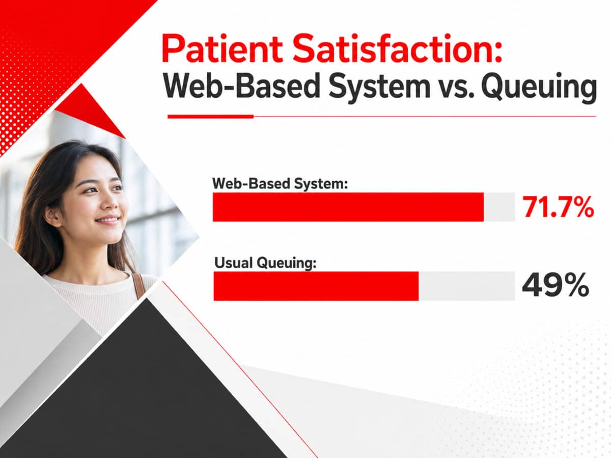
- Web-based scheduling produced 71.7% patient satisfaction against 49.0% for queue-style contact, so collapsing the access path to click-to-call, single-step verification, and real availability outperforms contact forms 4.
- Sequence the roadmap by fixing comprehension and access first, then simplify layout and centralize editorial governance across facilities, since distributed authorship reopens the readability gap the rewrites closed 12, 6.
The Digital Front Door Problem in Behavioral Health
Most behavioral health websites are engineered as brochures and evaluated as marketing assets. The people arriving on them behave differently. They are looking for a way in, often on a phone, often under duress, and often on behalf of someone else. The gap between how sites are built and how prospective patients actually use them is where inbound admissions calls quietly disappear.
Evaluations of hospital and health system websites consistently find deficits in usability, service clarity, and clear access pathways, meaning the sites are not organized around the tasks patients are trying to complete 13. In behavioral health specifically, the problem compounds. Public mental health content has been graded as low quality on standardized instruments like DISCERN, and readability routinely sits well above what most adults can process on a first pass 7. A visitor who cannot understand what a program does, cannot find how to reach it, or cannot complete an inquiry without friction is a lost call, not a lost lead.
The more useful frame treats the site as a clinical access channel. The research points to three levers that shape whether traffic converts: content calibrated to sixth-grade readability, interaction simplicity that reduces cognitive load, and self-service pathways that behave like scheduling systems rather than contact forms 5, 10, 4. Aesthetic polish and credentialing badges matter, but they sit downstream of the levers that actually move volume. The sections that follow rank each of these against the evidence, then translate them into a design roadmap a CMO can defend to a CEO.
Readability: The Sixth-Grade Standard No One Meets
Public health communication guidance has held a consistent line for decades: patient-facing content should read at roughly a sixth-grade level, with short sentences, plain vocabulary, and the most important information placed first 12. Behavioral health websites almost never clear that bar. A 2023 systematic review of publicly available mental health information found grade-level readability scores ranging from the 6th grade all the way to the 17th grade across conditions and platforms, with most content clustered well above the recommended threshold 5. The review covered general mental health topics rather than admissions pages specifically, but the pattern maps directly onto how treatment centers write about detox, dual diagnosis, and levels of care.
A more recent evaluation using the DISCERN instrument reinforced the same gap. The average readability grade level across sampled mental health sites came in at 14.63, with a Flesch Reading Ease score of 31.63, a range typically classified as difficult and appropriate for a college readership 7. Prospective patients arriving on a treatment center site under acute stress, and often on a mobile device, are not equipped to parse that density. The effect compounds among users with limited health literacy, who are already less likely to complete digital tasks like portal registration or online forms 14.
The conversion consequence is straightforward. When a program page uses clinical terminology that a first-time reader must translate, the cognitive cost of the page rises and the probability of a call falls. Comprehension is not a courtesy layer sitting on top of the site; it is a precondition for the desired action. A visitor who does not understand what medically supervised withdrawal management involves, or how a partial hospitalization program differs from intensive outpatient, is unlikely to volunteer a phone number and wait for a callback.
Concrete rewriting rules follow from the CDC’s plain-language guidance:
- Sentences should sit under 20 words on average.
- Paragraphs should carry one idea.
- Clinical terms should appear once with a short gloss and then in plain form.
- Headers should describe what the reader can do or learn, not what the department is called internally 12.
Applied consistently across program pages, admissions FAQs, and insurance-verification copy, these rules typically drop a treatment center site from a college reading level into the 7th-to-9th grade band, closer to the standard the evidence supports.
Simplicity as a Predictor of Use
Perceived simplicity is not a stylistic preference. It is a measured antecedent of whether patients actually use a digital health interface. An empirical study of patient portals concluded that aesthetic evaluations of simplicity function as a significant predictor of intention to use the tool, independent of the tool’s functional value 10. The finding was drawn from portal users rather than admissions-page visitors, but the mechanism transfers. A visitor who reads a page as cluttered assigns it a lower expected payoff and disengages before completing the primary action.
On a treatment center site, clutter usually shows up in three places: the header, the program page, and the contact module.
- Headers stacked with a full mega-menu, a phone number, a chat widget, a language toggle, and two secondary calls to action force the visitor to allocate attention before any content loads.
- Program pages that mix accreditation logos, testimonials, insurance carrier grids, and clinical detail into a single scroll break the reader’s focus at the moment comprehension matters most.
- Contact modules that surface a ten-field form alongside a phone number, a chat prompt, and a callback request split intent across too many paths.
The simplicity principle argues for one dominant action per screen and a visible hierarchy that ranks content by decision weight. Program summaries belong above credentialing. A single primary call-to-action belongs above a secondary one. Insurance verification belongs on its own step rather than embedded inside a program page. The same evidence base flags an equity dimension: portal engagement drops sharply among users with limited health literacy, and interface complexity is a documented contributor to that gap 14. A simpler layout is not only better for conversion averages, it narrows the range of visitors who can complete the intended path.
Two operational tests separate simplicity from minimalism:
- Count the number of distinct actions a visitor can take on a program page above the fold. If the number exceeds three, the page is competing with itself.
- Time how long it takes an outside reader to identify the single most important next step. If the answer is longer than three or four seconds, the visual hierarchy has failed, regardless of how clean the page looks.
Both tests can be run without analytics access and produce a shortlist of pages to prioritize in the next design sprint.
Self-Service Access: Designing the Site Like a Booking System
The most consequential design decision on a treatment center site is whether the primary access path behaves like a booking system or a marketing form. A pilot comparing web-based appointment scheduling to traditional queue-based registration found that patients using the web-based system reported satisfaction of 71.7%, against 49.0% for those routed through the usual queuing process 4. The study covered outpatient registration in a hospital setting rather than admissions inquiries specifically, but the mechanism is the same: friction at the point of access depresses satisfaction, and satisfaction predicts follow-through.
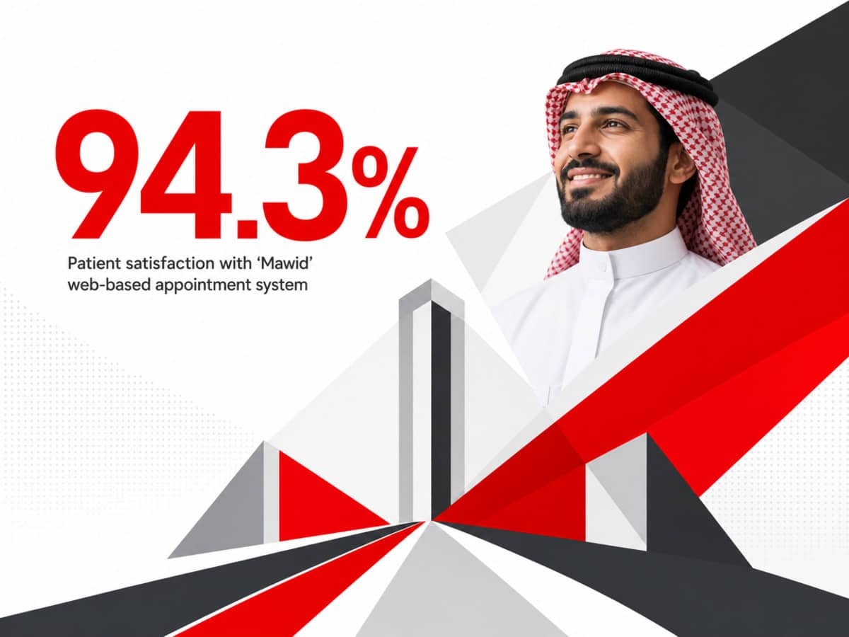
The ceiling on that curve is high. Patient satisfaction with a national web-based appointment platform reached 94.3% among users, with roughly 87 to 88 percent agreeing that the system let them book, modify, and cancel appointments effectively 2. Behavioral health admissions are not primary care visits, and the population is not identical, but the finding sets a useful benchmark. When digital access is designed like a real scheduling product, patient response is not lukewarm. It is decisively positive.
Most treatment center sites do not offer that experience. The dominant pattern is a contact form paired with a phone number, sometimes a chat widget, sometimes a callback request. Every one of those paths asks the visitor to hand off intent and wait. A booking-system model inverts that arrangement. It surfaces available intake windows, offers a click-to-call option that dials the admissions line directly with call tracking attached, and lets the visitor initiate insurance verification without an intermediate form. The specific mechanisms differ by facility, but the design principle is consistent: reduce the number of steps between arrival and a committed action.
Operational evidence supports the same conclusion. A case study of automated patient self-scheduling in a large health system documented reductions in labor cost, improvements in satisfaction, and lower no-show rates when self-service scheduling was integrated with broader patient communication workflows 6. The same paper flagged the honest constraint: organizational hesitancy and workflow complexity limit adoption, so the technology alone does not deliver the gains. For a treatment center, that translates to a specific handoff: whatever the visitor initiates on the site must arrive in the admissions team’s queue with enough context to move immediately, or the self-service layer creates a second friction point rather than removing the first.
Adoption is uneven across visitor segments. A 2024 mixed-methods study of online appointment booking in primary care found meaningful demographic variation in who uses digital scheduling and who does not, along with equity concerns for groups that remain reluctant or unable to book online 1. A treatment center site that removes the phone number in favor of a self-service flow will lose the visitor who needed to talk to someone at the moment of decision. The design implication is dual-track: a booking-style path for visitors ready to act digitally, and a prominent, always-visible call option for those who are not. Both should route through the same tracking layer so admissions can measure which channel converted, at what quality, and from which page.
Data-Driven Website Design That Converts Traffic to Admissions
Leverage research-backed healthcare website design strategies proven to increase qualified admissions calls and strengthen brand trust for behavioral health organizations.
Optimize Your SiteTrust Signals, Ranked by Evidence Not Instinct
The standard advice on trust signals treats them as a bucket: accreditation badges, staff photos, testimonials, secure-form icons, HIPAA language, LegitScript verification. The bucket approach obscures the fact that some signals do measurable work and others sit as decoration. On behavioral health sites specifically, the evidence points to a narrower hierarchy, and the top of that hierarchy is content quality rather than iconography.
A 2026 evaluation of online mental health information applied the DISCERN instrument to both government and non-government sources. Government sites, which most CMOs would assume carry the strongest inherent authority, were rated poor or very poor on quality in 80.95% of cases. Non-government sites were rated poor or very poor in 22.22% of cases 7. The counterintuitive result matters for design decisions. Authority does not equal credibility on-page. A visitor evaluating a treatment center is not verifying the site against a public registry of credentials. They are reading the content in front of them and forming a judgment about whether the organization understands their situation. Quality of explanation outperforms institutional stature as a trust cue.
That reframing changes what belongs above the fold. First-order trust signals — clinical accuracy, specific descriptions of what a program includes, and honest answers to the questions a family arrives with — do more credibility work than a row of accreditation logos placed where the primary content should be. A page that explains what medically supervised withdrawal management looks like on day one, day three, and day seven does more credibility work than a row of accreditation logos placed where the primary content should be. The same applies to insurance transparency. Naming the carriers accepted, explaining what verification involves, and stating what the visitor will be asked for treats the reader as a decision-maker rather than a lead.
Second-order signals are the ones the CRO literature usually emphasizes: Joint Commission or CARF accreditation, LegitScript certification, licensed clinician bios with credentials visible, real facility photography rather than stock imagery, and outcomes data where it can be substantiated. These belong on the site, but they function as confirmation rather than persuasion. A visitor who has already decided the content reads as credible uses these signals to close the loop. A visitor who found the content confusing or evasive does not recover trust by seeing a badge.
Third-order signals are the ones that quietly erode when misused: patient testimonials that read as marketing copy, before-and-after language that raises regulatory flags, and stock imagery of models in clinical settings. Each of these can move a visitor toward skepticism when the surrounding content has not earned the claim. The design rule is straightforward. Rank trust signals by the work they do, not by how prominent competitors make them, and audit whether the content underneath the badges can withstand the same scrutiny the badges are meant to signal 13.
If You Manage Multiple Locations: Centralized vs Facility-Level Architecture
For CMOs at multi-facility operators, the design decisions above compound. A single-facility site has one program page, one admissions line, and one governance owner for content. A portfolio of six or fifteen facilities has to decide whether each location gets its own microsite, whether scheduling routes to a central intake team or facility-level staff, and who owns the readability standard across programs that vary by state license and level of care. The wrong architecture multiplies the same design problems across every URL.
Two models dominate:
- In a centralized architecture, one domain hosts location pages, intake routes through a single admissions team, and content governance sits with the marketing organization.
- In a facility-level architecture, each location operates a distinct site or a heavily autonomous section, with intake and content owned locally.
Neither model is inherently correct. The evidence supports different tradeoffs on each of four variables that a CMO can defend to a CEO.
| Variable | Centralized intake | Facility-level intake |
|---|---|---|
| Scheduling satisfaction | Higher ceiling when built as a unified booking product; national platforms have reached 94.3% satisfaction with a single well-designed system 2. | Variable; satisfaction gains from web-based access still hold locally (71.7% vs 49.0%), but consistency across sites depends on each facility’s implementation 4. |
| No-show reduction | Stronger when self-scheduling integrates with a single communication workflow, which the evidence links to lower no-show rates 6. | Weaker when each location runs its own reminder cadence and intake handoff, fragmenting the workflow the same study identifies as the mechanism 6. |
| Readability governance | One editorial standard applied across programs, which is the only realistic way to close the grade-level gap documented in mental health content 5. | Drift is likely; DISCERN evaluations of mental health sites already show wide quality variance, and distributed authorship amplifies it 7. |
| Adoption barriers | Concentrated: one workflow change, one training rollout, one point of organizational hesitancy to overcome 6. | Distributed: each facility becomes its own adoption project, and the self-scheduling literature identifies workflow complexity as the primary constraint on gains 6. |
The practical implication is not that centralized always wins. Facility-level pages are often necessary for local SEO, state-specific licensing disclosures, and location-specific clinical differentiators that a national template flattens. What the evidence argues against is a hybrid where each facility publishes its own program copy with no shared readability standard, and each intake team fields calls without a unified tracking layer. That configuration inherits the disadvantages of both models: inconsistent content quality, fragmented workflow, and no clear place to measure which page produced which admission.
The workable pattern for most operators is centralized governance with facility-level surfaces. One editorial team owns readability and program descriptions across the portfolio. Location pages carry local trust signals, staff, and photography. Scheduling and click-to-call routes through a single tracked layer that hands off to whichever intake team owns the facility, so the visitor experience is consistent while attribution stays clean at the location level.
What the Evidence Supports vs What CRO Opinion Assumes
Conversion optimization writing in the treatment space leans heavily on assumptions imported from ecommerce and lead-gen: heatmap-driven button colors, urgency language, exit-intent overlays, and testimonial carousels. The peer-reviewed evidence on healthcare digital access points somewhere different. Three levers carry the strongest empirical support, and several widely repeated tactics do not appear in the research at all.
Supported by evidence:
- Comprehension calibrated to a sixth-grade reading level, with the mental health content universe currently sitting far above it 5, 15.
- Interface simplicity as a measured predictor of whether patients actually use a digital health tool, independent of what that tool can do 10.
- Self-service scheduling paths that reduce steps between arrival and a committed action, with satisfaction and no-show reductions documented across multiple studies 4, 6.
- Content quality, measured against instruments like DISCERN, as a stronger credibility cue than institutional authority 7.
Assumed but unsupported in the supplied research:
- Specific conversion lifts from button color changes, sticky headers, or countdown timers.
- Testimonial density as a primary driver of inbound calls.
- Chatbot deflection as a substitute for a visible phone number, given documented demographic variation in who will use digital-first paths at all 1.
- Accreditation badge placement as a top-of-hierarchy signal, when content quality outranks it in the evidence 7.
The distinction matters when a design roadmap goes to a CEO for funding. Investments in readability rewrites, layout simplification, and scheduling architecture can be defended with published effect sizes. Investments in cosmetic CRO tactics cannot, at least not from the healthcare literature. A CMO who separates the two categories is in a stronger position to protect the budget that actually moves admissions volume.
A Prioritized Roadmap for the Next Two Quarters
Design roadmaps in behavioral health tend to fail on sequencing. Teams start with a visual refresh, add badges, then discover six months later that the underlying content still reads at a graduate level and the contact path still asks for a phone number, an email, and a preferred callback window. The order matters, because each lever below compounds the ones that follow.
- Quarter one belongs to comprehension and access. Audit every program page against a plain-language standard, targeting the 7th-to-9th grade band as a realistic first pass toward the sixth-grade recommendation the guidance actually asks for 12. In parallel, collapse the primary access path to a click-to-call button with tracking, a single-step insurance verification, and a scheduling option that surfaces real availability rather than a callback promise. The satisfaction delta between web-based scheduling and queue-style contact paths is the mechanism this work is buying into 4.
- Quarter two belongs to simplification and governance. Strip program pages to one dominant action above the fold, move accreditation and testimonials below the primary content, and route every contact channel through a single tracking layer so admissions can attribute calls to pages. For multi-facility operators, install centralized editorial governance across location pages before any further design spend, because distributed authorship is the mechanism that reopens the readability gap the first quarter closed.
Frequently Asked Questions
What reading level should behavioral health website copy target?
Plain-language guidance places the target at roughly sixth grade for patient-facing content, with short sentences and the most important information first 12. Most behavioral health sites sit far above that, with public mental health content evaluated at grade levels well into the college range 15. A realistic first pass moves program pages and admissions copy into the 7th-to-9th grade band, then tightens further where clinical terminology is unavoidable.
Does adding online self-scheduling actually increase admissions calls, or does it cannibalize them?
The evidence points to expansion rather than substitution when both paths are visible. Demographic studies of online booking show meaningful variation in who uses digital scheduling and who prefers to call, with some groups remaining reluctant to book online at all 1. A dual-track design that surfaces a click-to-call option alongside a scheduling flow captures both segments. Removing the phone number in favor of a self-service path forfeits the visitor who needed to speak with someone.
Which trust signals matter most on a treatment center website?
Content quality outranks iconography. DISCERN-based evaluations of mental health sites found that even authoritative sources score poorly on quality when explanations are unclear or incomplete 7. Specific descriptions of programs, honest insurance information, and clinical accuracy function as first-order trust signals. Accreditation badges, credentialed clinician bios, and real facility photography work as confirmation, not persuasion. A visitor who found the content evasive will not recover confidence by seeing a logo bar.
For a multi-location operator, should scheduling and intake be centralized or handled at the facility level?
Centralized governance with facility-level surfaces is the workable pattern for most operators. Self-scheduling gains from lower no-shows and higher satisfaction depend on integration with a single communication workflow, which fragments when each facility runs its own intake 6. Location pages still carry local staff, photography, and licensing details. Scheduling and click-to-call route through one tracked layer that hands off to the correct facility team, keeping attribution clean without duplicating design decisions across every URL.
How should design priorities be sequenced when the roadmap can only fund a few changes?
Comprehension and access come first, because both operate upstream of every other lever. Rewrite program pages against a plain-language standard, then collapse the primary contact path into a click-to-call button and a single-step verification flow. Web-based scheduling has produced satisfaction of 71.7% against 49.0% for queue-style access, and that delta is the mechanism the sequence is buying 4. Simplification of layout, trust-signal ranking, and aesthetic work follow once the access channel functions.
Is a website redesign necessary, or can targeted changes deliver most of the conversion gains?
Targeted changes deliver most of the gain when the underlying architecture is sound. Readability rewrites, a consolidated contact module, and a tracked scheduling path can move call volume without a full rebuild. A redesign becomes necessary when navigation buries service information, when the site fails on mobile, or when hospital-website evaluations of the current build would flag deficits in usability and access clarity 13. The trigger is structural, not cosmetic. Cosmetic dissatisfaction rarely justifies the spend.
References
- Investigating Patient Use and Experience of Online Appointment Booking in Primary Care: Mixed Methods Study. https://pubmed.ncbi.nlm.nih.gov/38976870/
- Evaluation of Patient Satisfaction With the New Web-Based Medical Appointment System “Mawid” in Primary Health Care Centers in Saudi Arabia. https://pmc.ncbi.nlm.nih.gov/articles/PMC9940665/
- Evaluation of patient satisfaction of the status of appointment scheduling system in a tertiary care hospital. https://pmc.ncbi.nlm.nih.gov/articles/PMC6078003/
- A web-based appointment system to reduce waiting for outpatients: a pilot study. https://pmc.ncbi.nlm.nih.gov/articles/PMC3238289/
- Readability of publicly available mental health information: A systematic review. https://pubmed.ncbi.nlm.nih.gov/36944285/
- Automated patient self-scheduling: case study. https://pmc.ncbi.nlm.nih.gov/articles/PMC9382371/
- Evaluating the Readability, Accessibility, and Quality of Online Mental Health Information. https://pmc.ncbi.nlm.nih.gov/articles/PMC12933433/
- Web-Based Patient Portals and Patient Engagement: A Systematic Review. https://pubmed.ncbi.nlm.nih.gov/32787862/
- The association between patient-facing digital health tools and health outcomes: A systematic review. https://pubmed.ncbi.nlm.nih.gov/30874131/
- Design simplicity influences patient portal use. https://pmc.ncbi.nlm.nih.gov/articles/PMC4954622/
- Patient Portals as Facilitators of Engagement in Patients With Chronic Conditions: Systematic Review. https://pmc.ncbi.nlm.nih.gov/articles/PMC10492174/
- Simply Put: A Guide for Creating Easy-to-Understand Materials. https://www.cdc.gov/healthliteracy/developmaterials/plainlanguage.html
- Evaluating the Quality, Usability, and Reliability of Hospital Websites for Patients. https://pmc.ncbi.nlm.nih.gov/articles/PMC8118790/
- Health Literacy and Patient Portals: A Systematic Review. https://pmc.ncbi.nlm.nih.gov/articles/PMC6393813/
- Quality and Readability of Online Patient Education Materials for Mental Health. https://pmc.ncbi.nlm.nih.gov/articles/PMC7425304/